The great grad/non-grad voting indicator

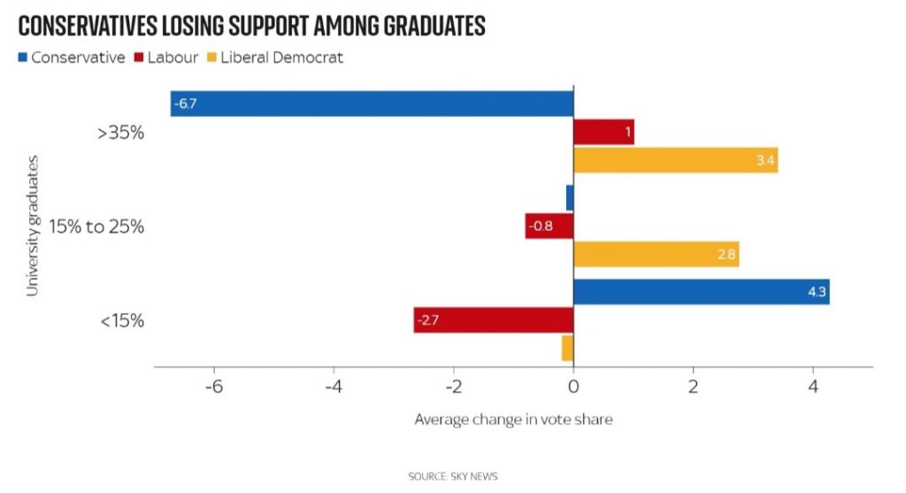
One of the best charts to explain this year’s local elections was the above one produced by Sky News during its coverage. It basically shows changes in vote share based on areas that have more or fewer graduates in the electorate than the population as a whole.
As can be seen, the Tories performed worst in areas where there were 35% or more graduates and did significantly worse in those areas which had 15% or less.
One of the things that always strikes me about US polling is how education is regarded as such a key factor. Thus you will hear all the time how, say, college-educated women are doing or non-college-educated men.
Based on last Thursday the party that’s making the most progress with graduates are the Lib Dems while the Tories saw an average 6.7% drop in vote share in areas with 35%+ graduates. At the same time, there was a 4.3% gain in the sub-15 % category of council areas.
In Wakefield about 25% of voters are graduates which is almost exactly the same proportion as in Tiverton & Honiton. In Chesham and Amersham, where the LDs made their first gain of the parliament, the figure is 40%+.