How’s the government comparing with its predecessors?
The 32 year view from Mrs Thatcher onwards
This is a chart that Ipsos-MORI produces on most months in order to put current government approval ratings figures in an historical context. It shows how the satisfied-dissatisfied numbers moved month by month in the first year after a general election.
So at this stage, the chart is based on February’s polling, the coalition is doing substantially better than John Major’s 1992 government and a touch better compared with nine months after Blair’s victories in 2001 and 2005.
Tony Blair, however, did substantially better after his 1997 landslide and managed to keep it positive for the whole of the first year.
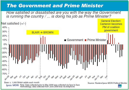
A second chart shows the government and Prime Minster ratings month by month since the start of 2006.

It should be noted with all historical comparisons of Ipsos-MORI data that the firm underwent major changes in June 2008 when all political polling was switched from face-to-face to the telephone – a move that is seen as helping the blues. The month after the change, July 2008, the pollster recorded its worst ever rating for a government with 77% dissatisfied against 18% satisfied.
