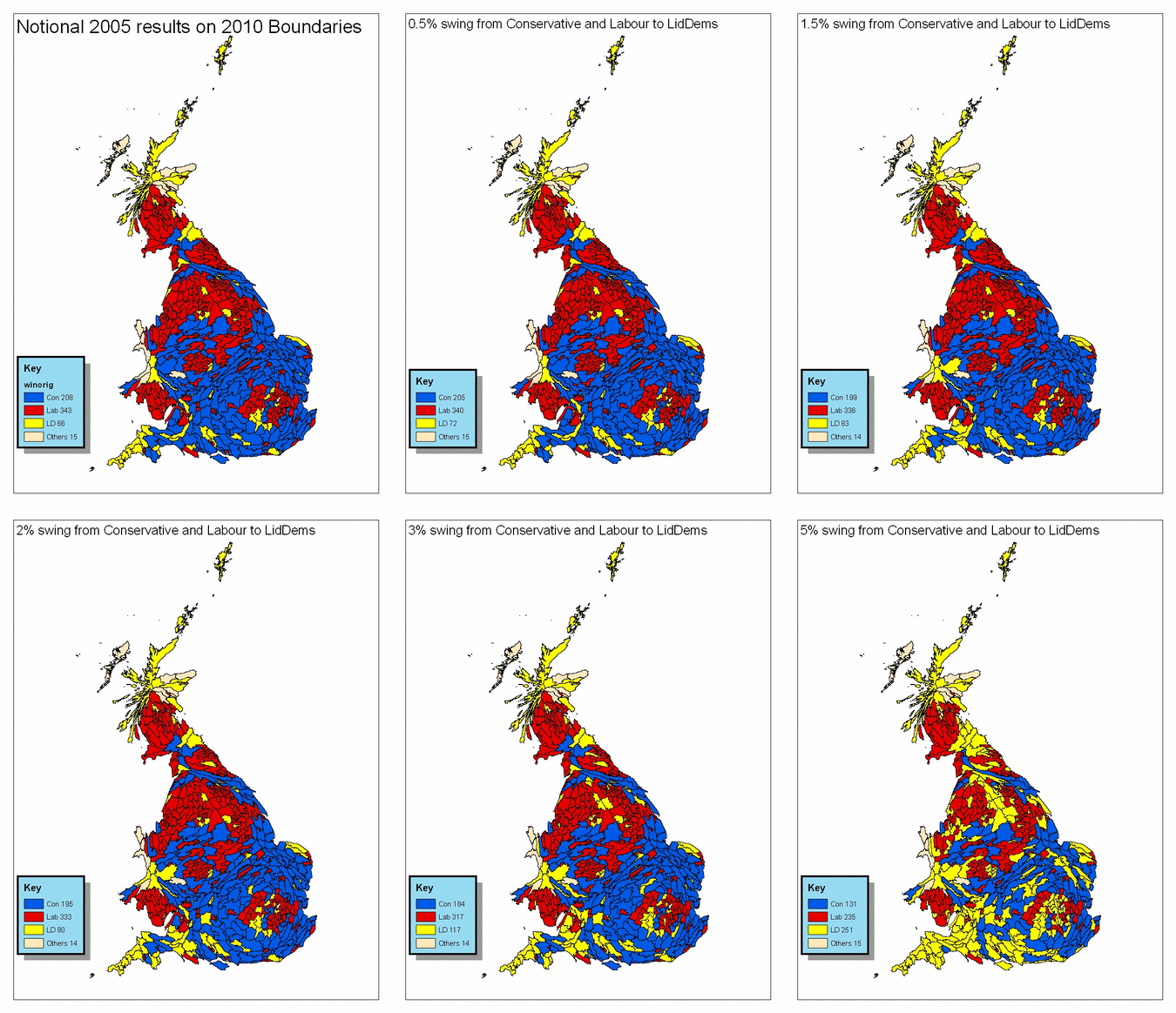
Is this how a swing to the LDs would go?

At what stage should the animation stop?
Philip Palfrey of the University of Sheffield has produced this animated graphic to illustrate how the political map of Britain could change depending on the level of swing to the Liberal Democrats.
A key element here is that the map shows all constituencies as being the same geographical size.
Philip has asked me to note that this work is based on data provided through EDINA UKBORDERS with the support of the ESRC and JISC and uses boundary material which is copyright of the Crown.