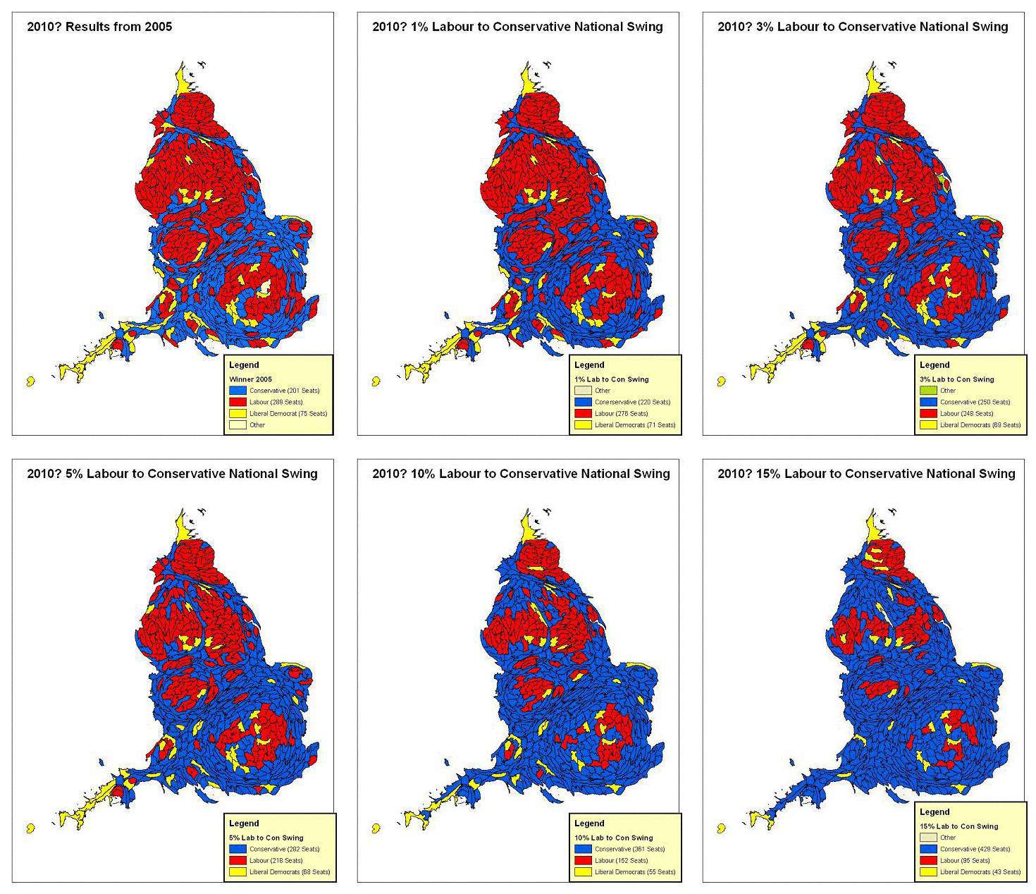
At what point will the animation stop?

Is this how the political map could change?
Philip Palfrey of the University of Sheffield has produced some fascinating graphic material to illustrate how the GB political map for what I think is England could change with different swings. Just look above and watch it change.
A key element here is that the map shows all constituencies as being the same geographical size.
He has other interesting material that I will feature in future posts.
Mike Smithson
PB: Political Website of the Year